Melagrião
With over a century of history, Melagrião is a trusted Brazilian brand known for its herbal syrups. However, despite its broader portfolio, it remained perceived primarily as a syrup brand. As demand for natural healthcare solutions grew, the challenge was to modernize the brand, strengthen its identity, and increase awareness of its full portfolio while preserving the essence and trust built across generations.
Role: Brand and Graphic Design
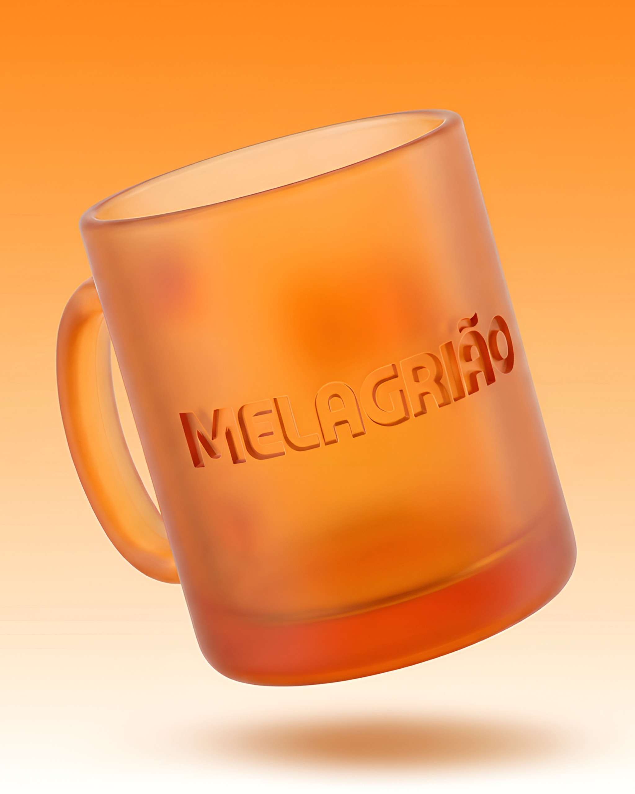
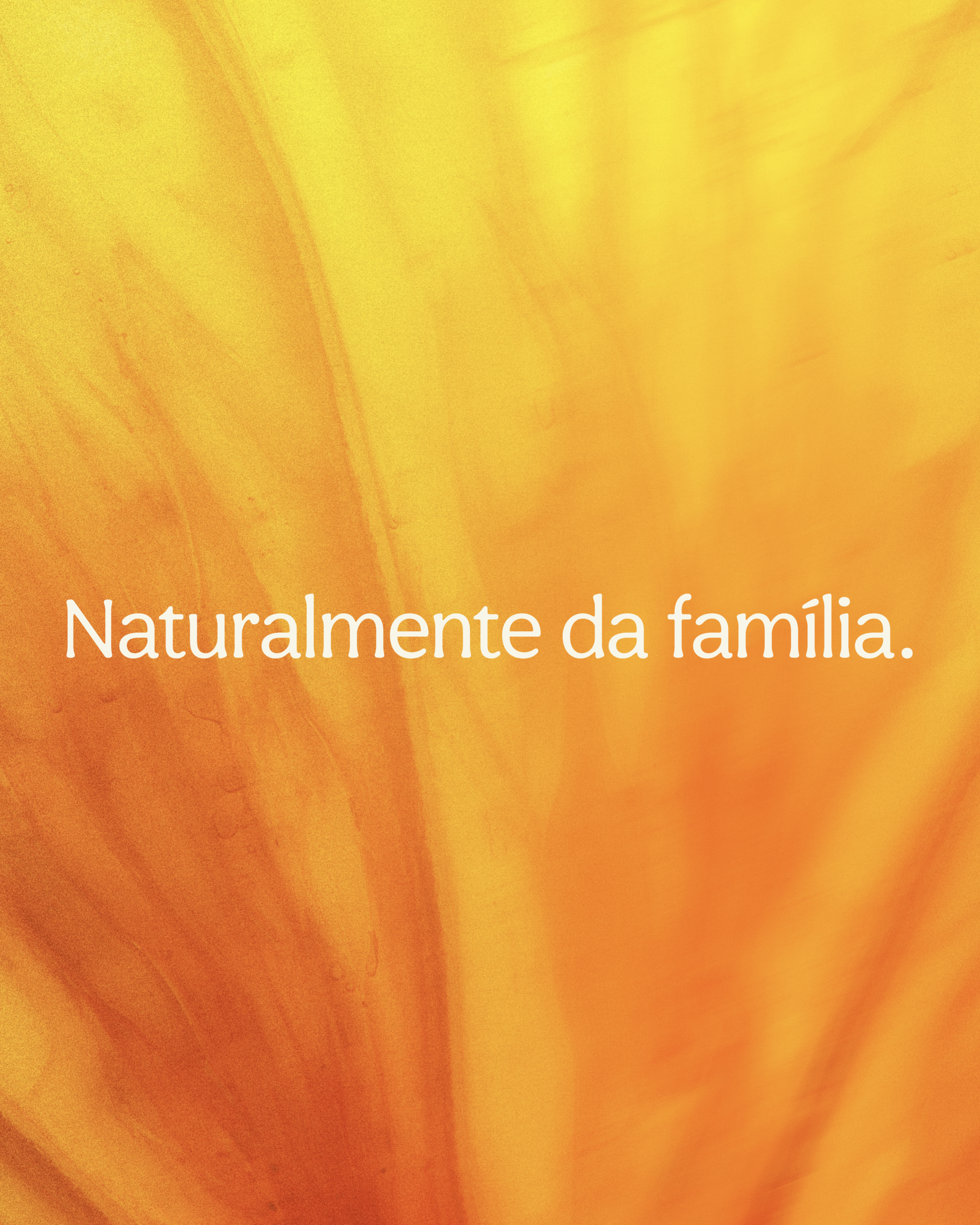
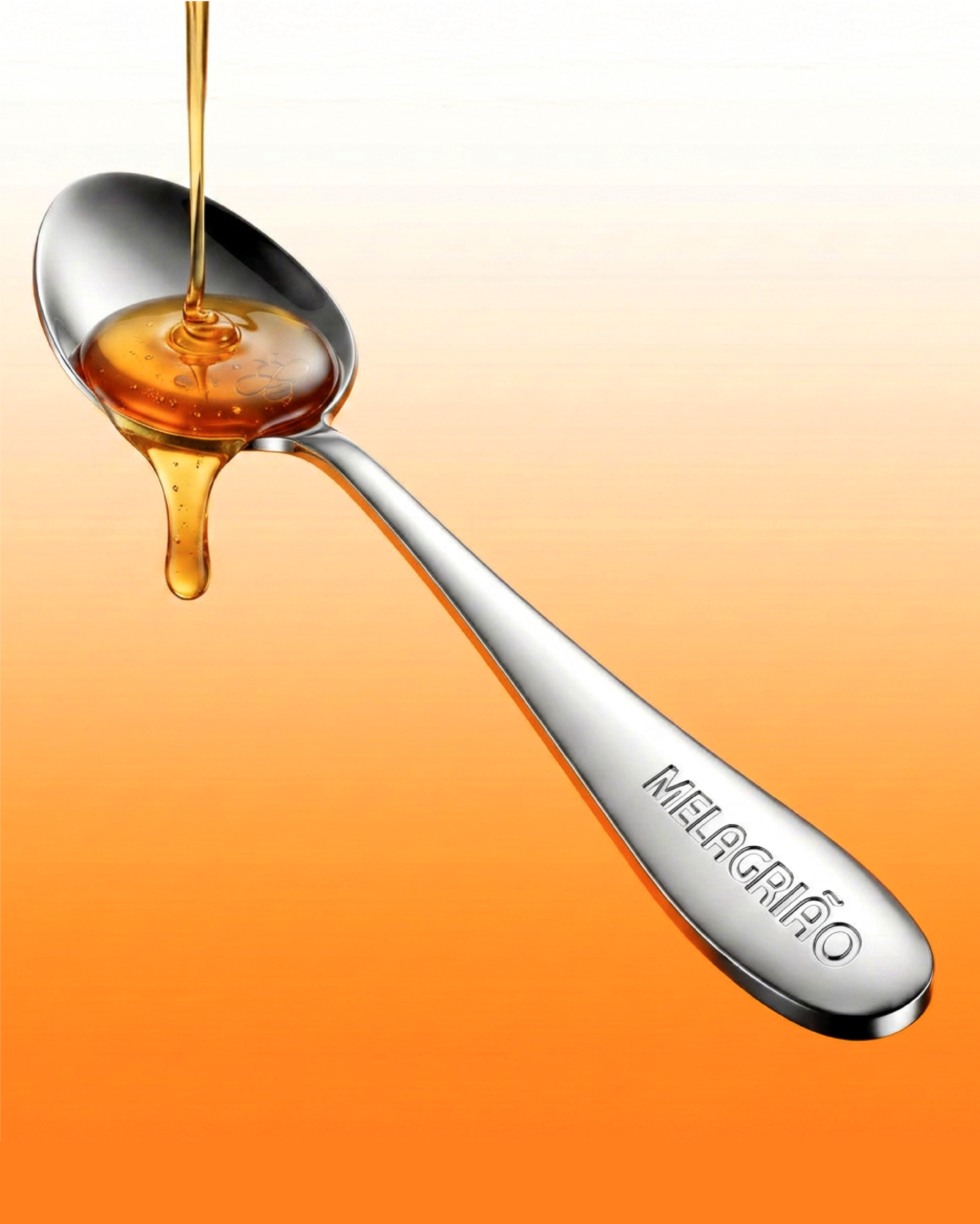
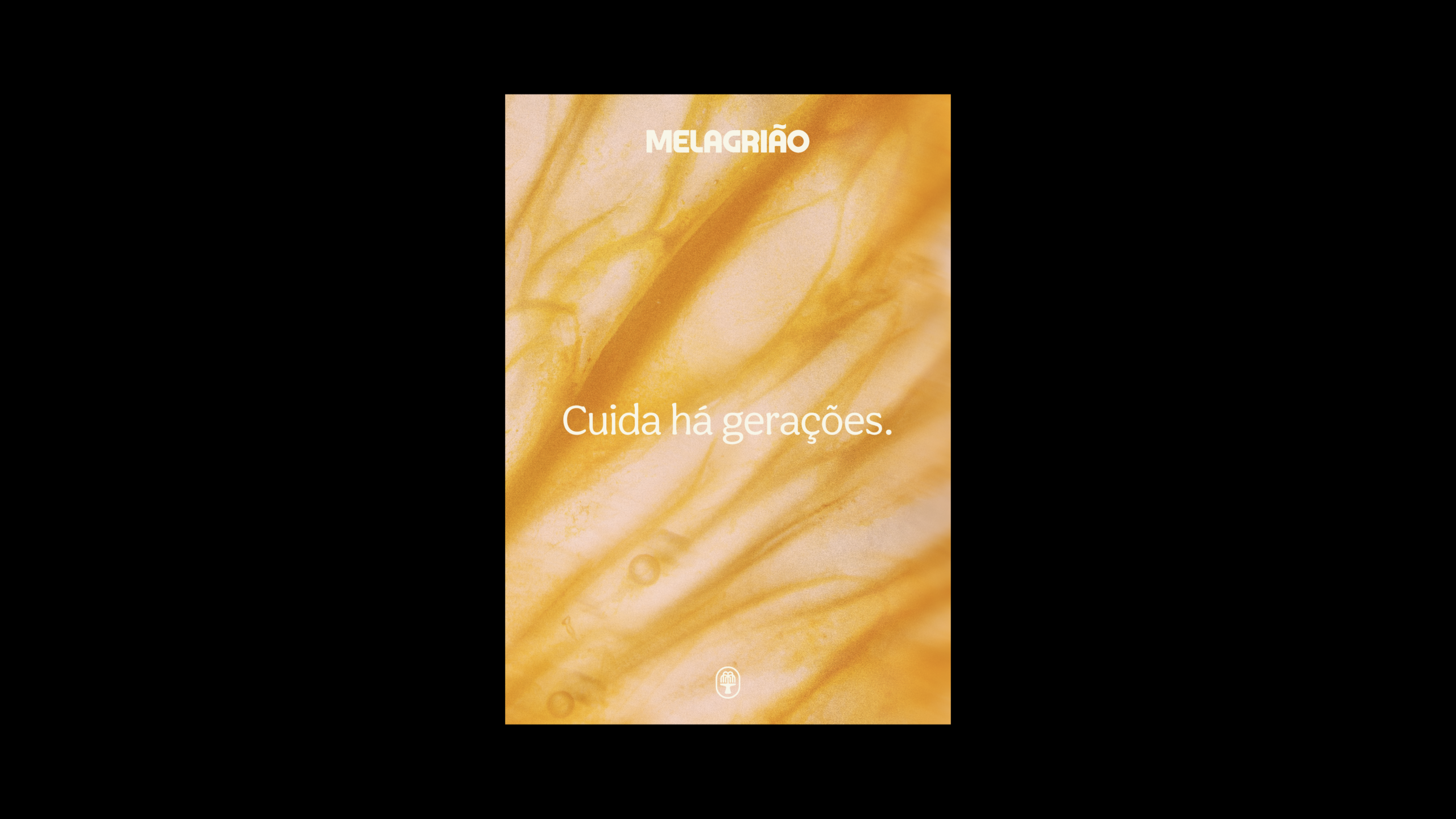
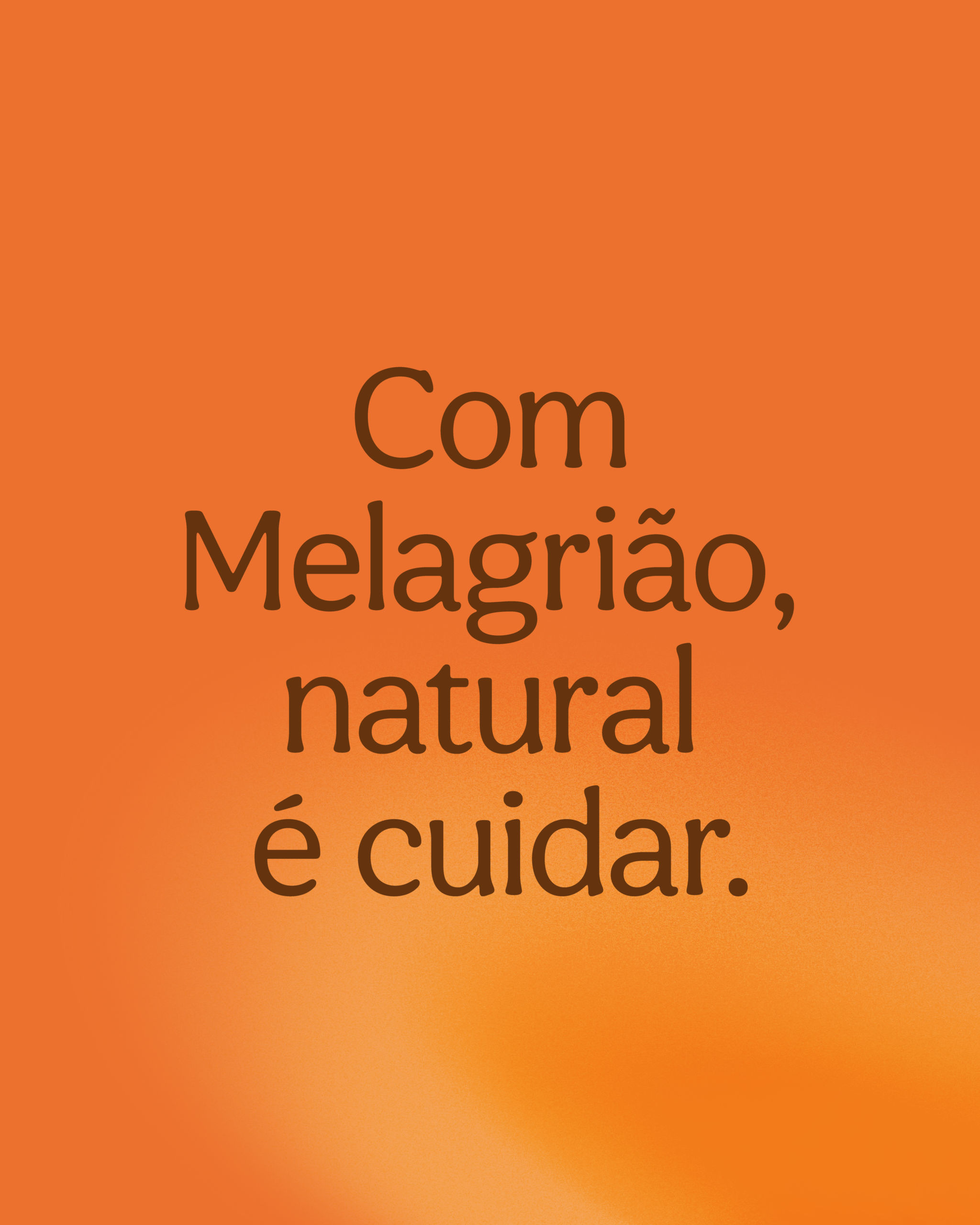
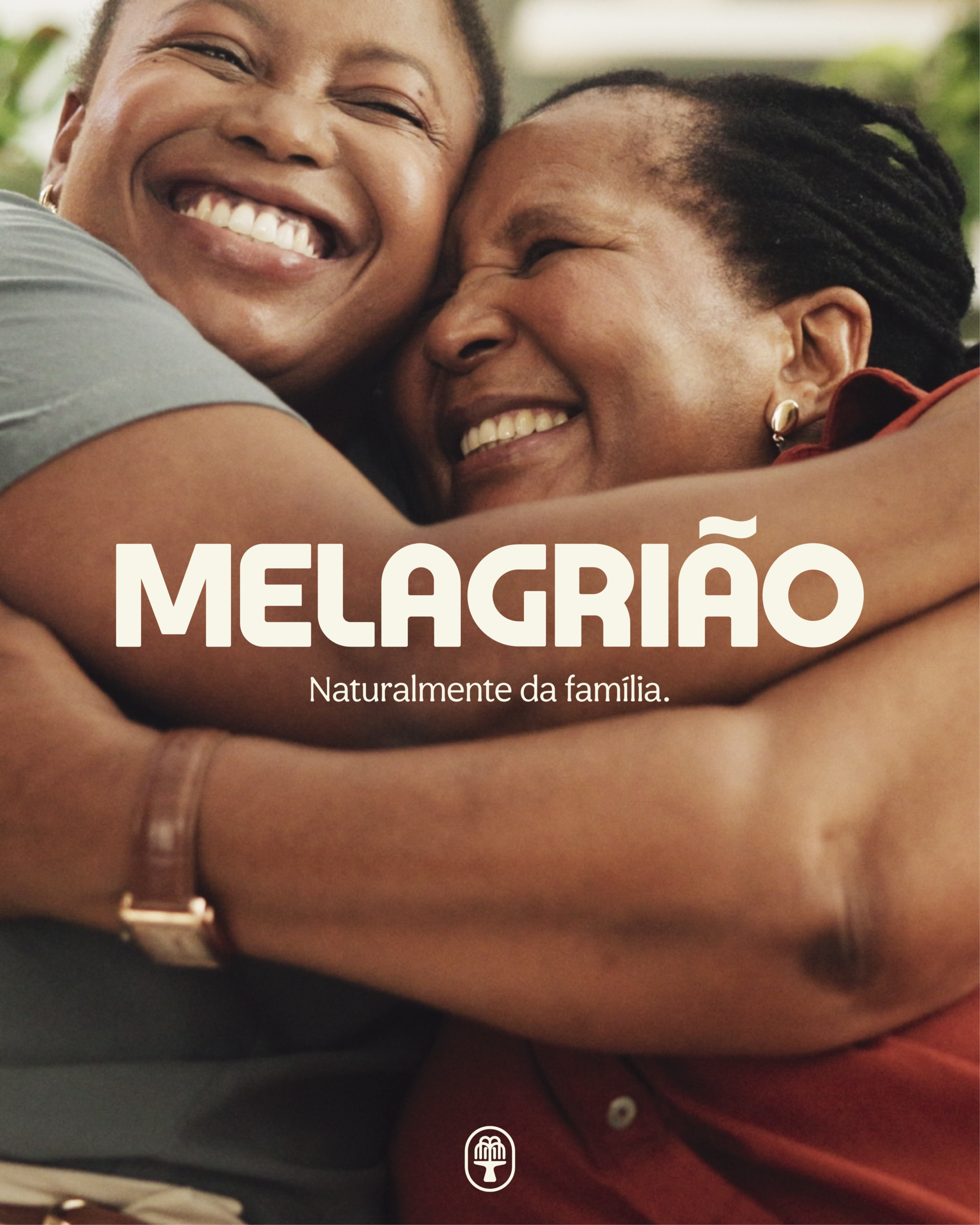
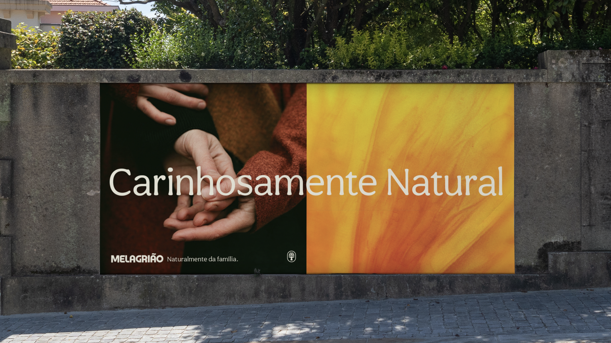
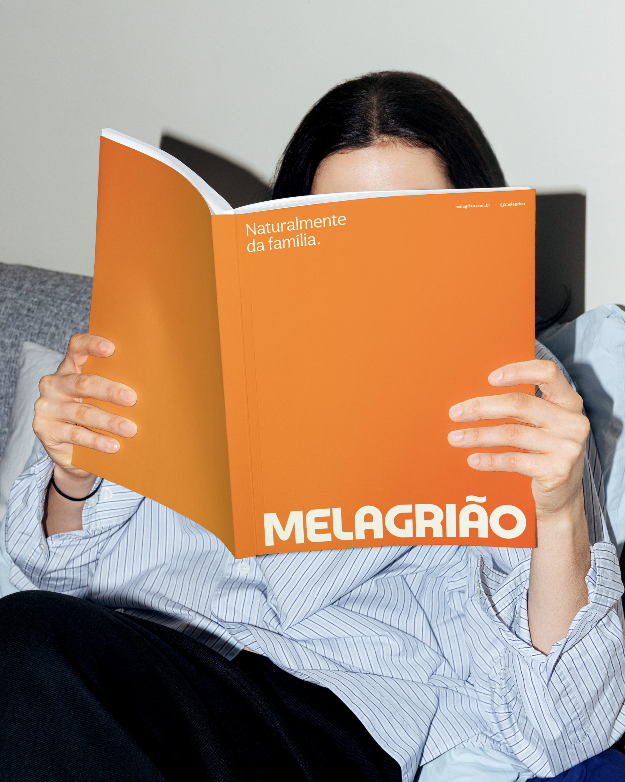
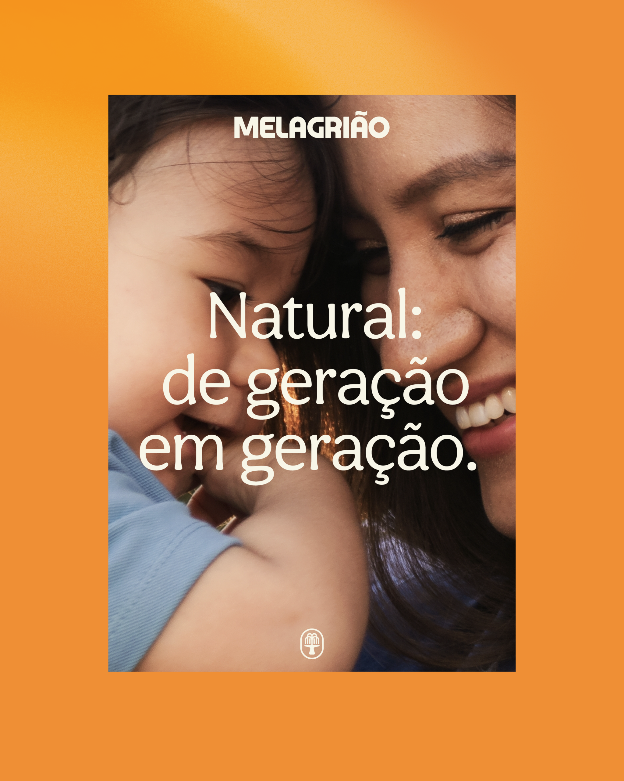
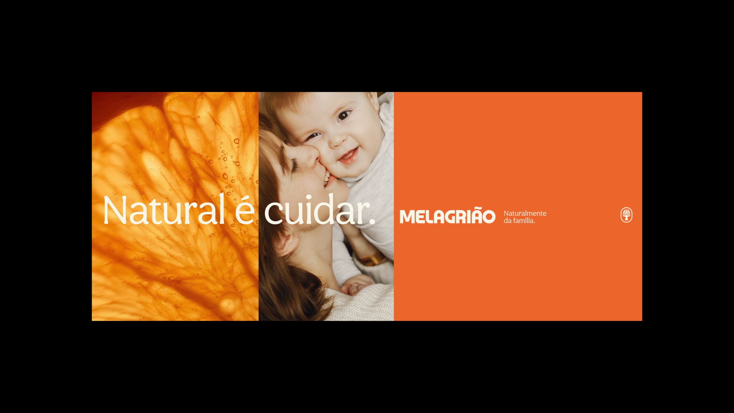
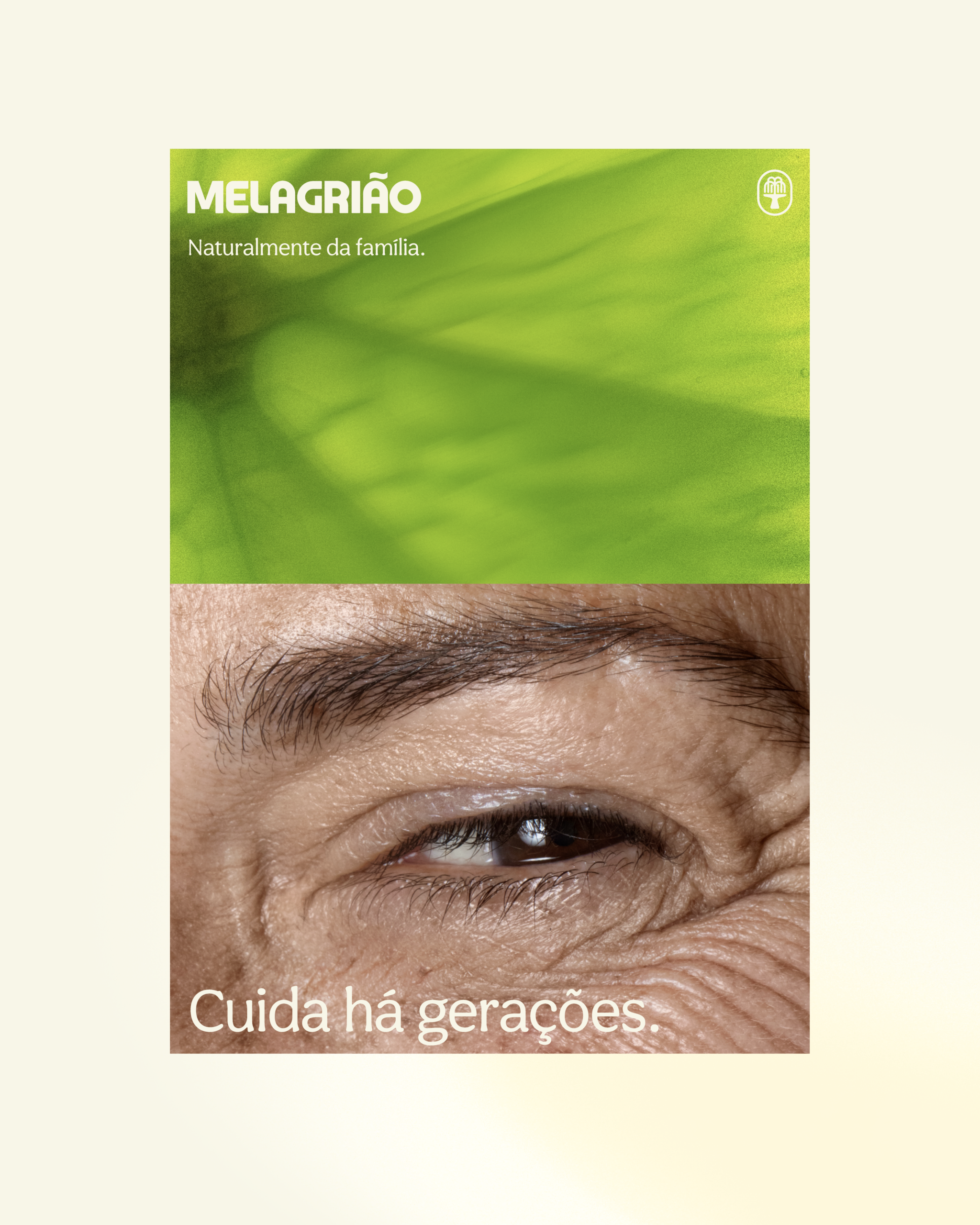
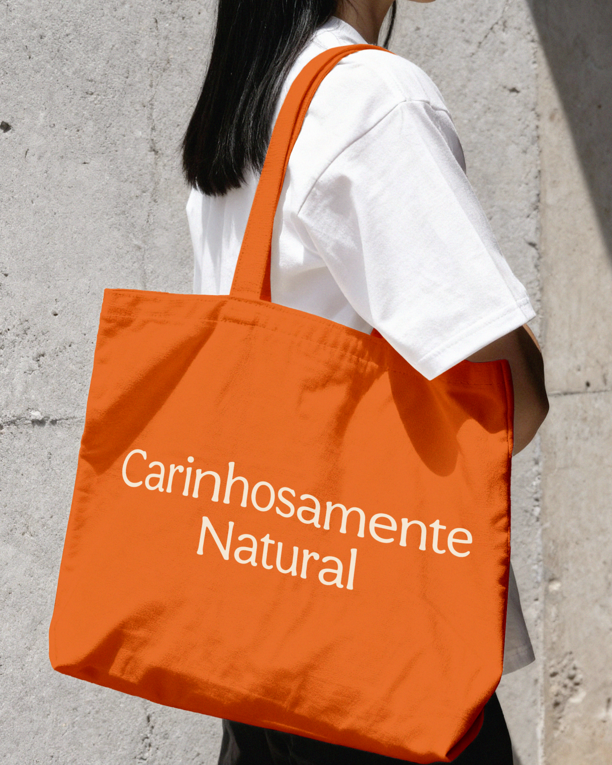
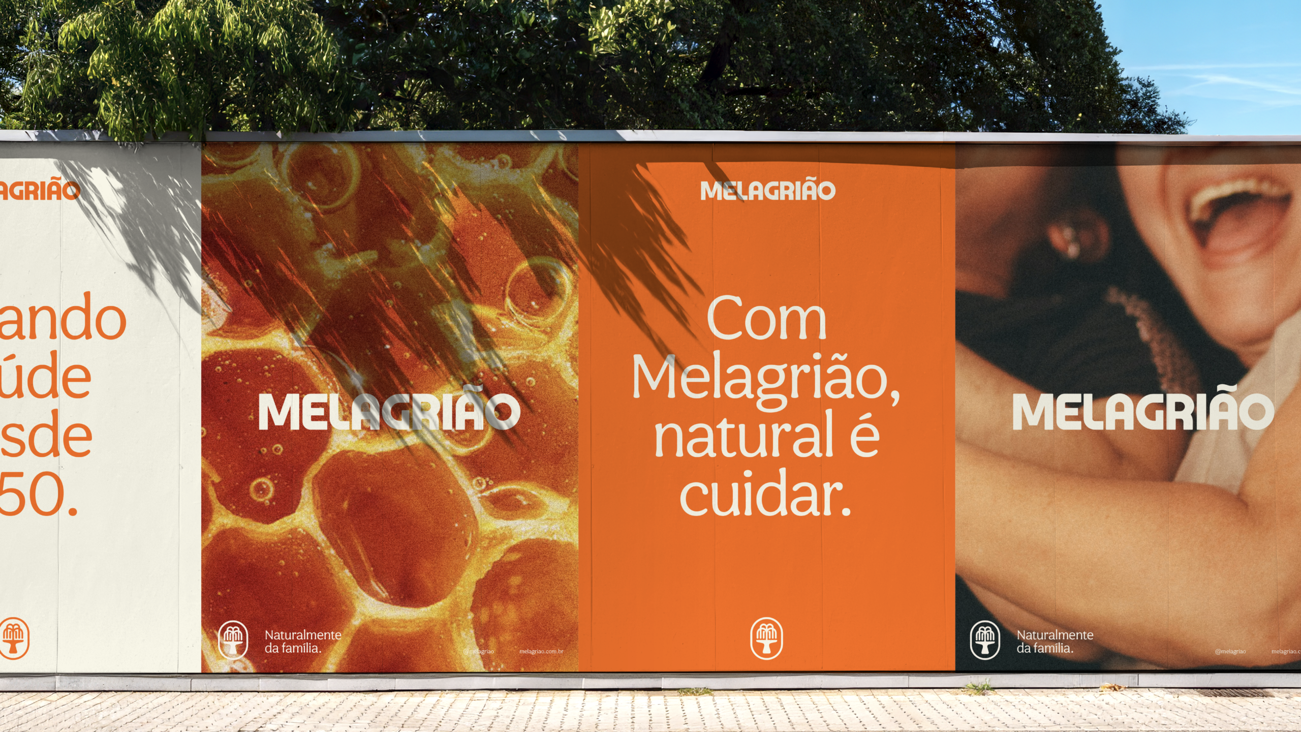
Melagrião’s legacy was the starting point for a brand refresh that preserved its recognition while adapting it to the present. Orange was reinforced as a key brand asset, paired with warm photography and lighting to evoke care, affection, and the feeling of being cared for at home. Macro images of honey and other natural ingredients highlight their textures and origins, making the product’s connection to nature tangible. The brand’s voice builds on trust, tradition, and its deep connection with Brazilian families, balancing an affectionate tone with the credibility of its formulas. Finally, the logo was refined to improve clarity and performance across touchpoints while preserving the elements that make Melagrião recognizable across generations.
Leadership: Danilo Cid, Luiza Cortoni; Design Team: Gabriel Catte, Fernanda Casas, Igor Oliveira, Felipe Garcia; Copy: Lucas Figueira; Strategy: Isabella Herdy, Thalyta Munhoz.
Anacouto, 2025