Tramontina: Evolving a Century Old Icon
Tramontina is a Brazilian industrial group founded in 1911, present in more than 120 countries, with a portfolio spanning kitchenware, tools, appliances, and furniture. Recognized for its craftsmanship and long-lasting quality, the brand set out to begin a new chapter in its visual history.
Role: Brand and Graphic Design
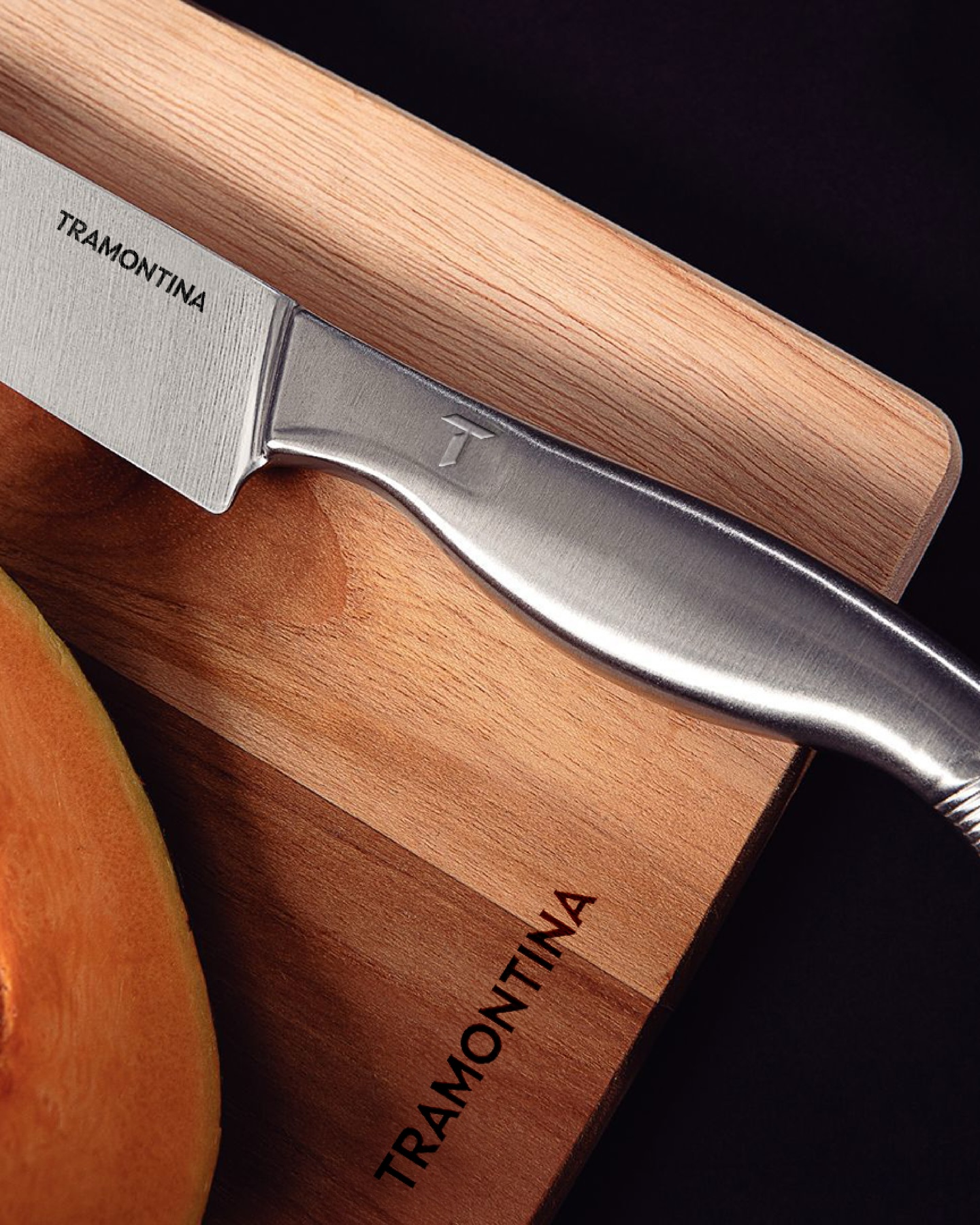

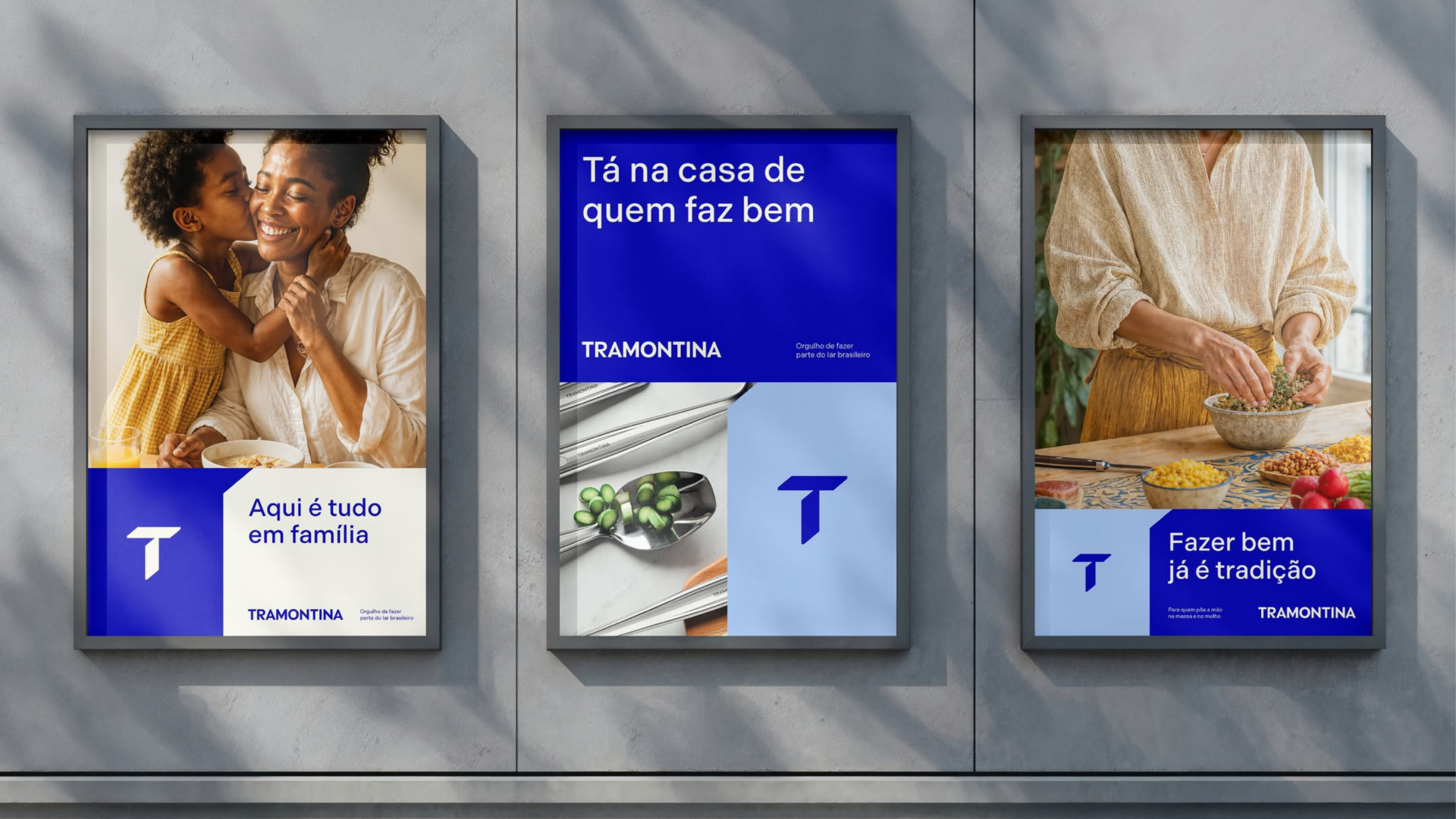
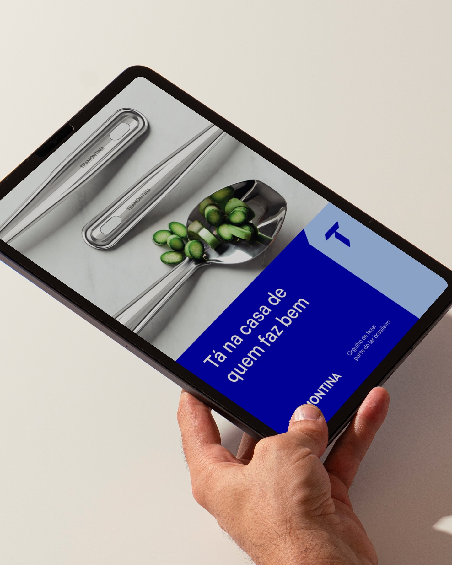
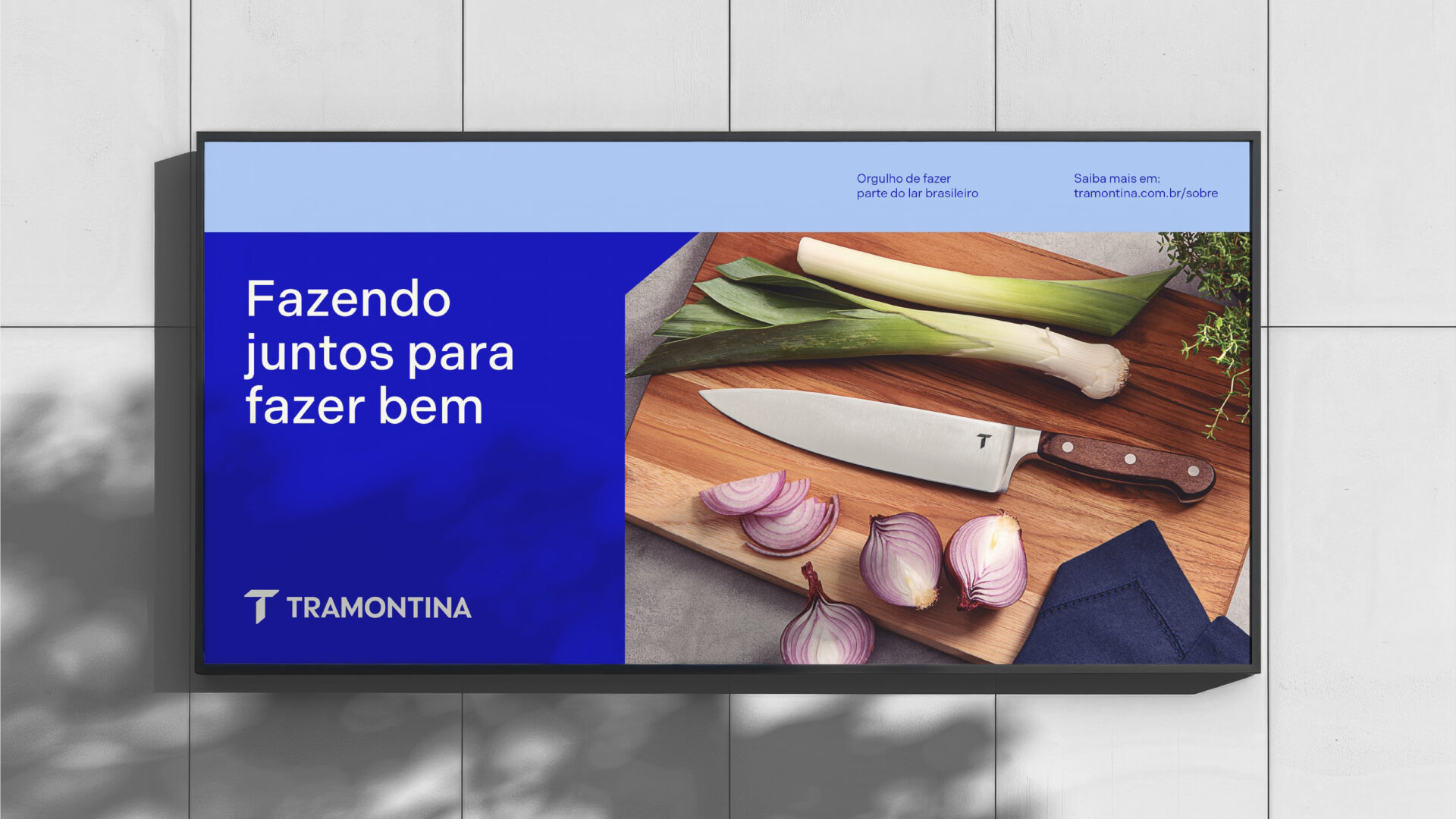
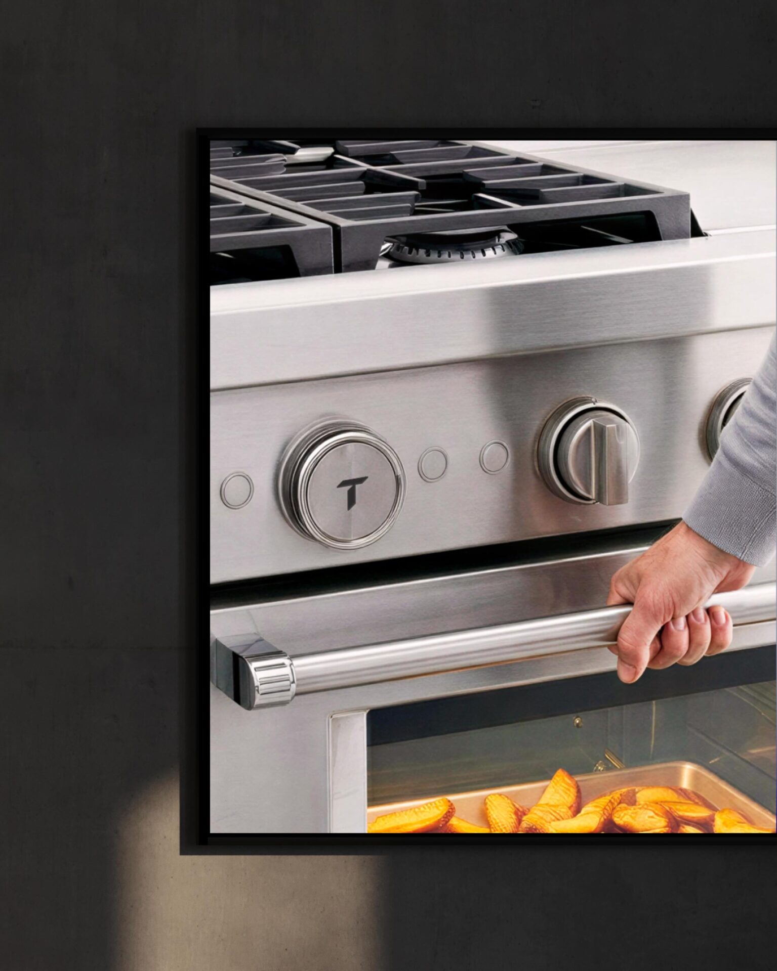
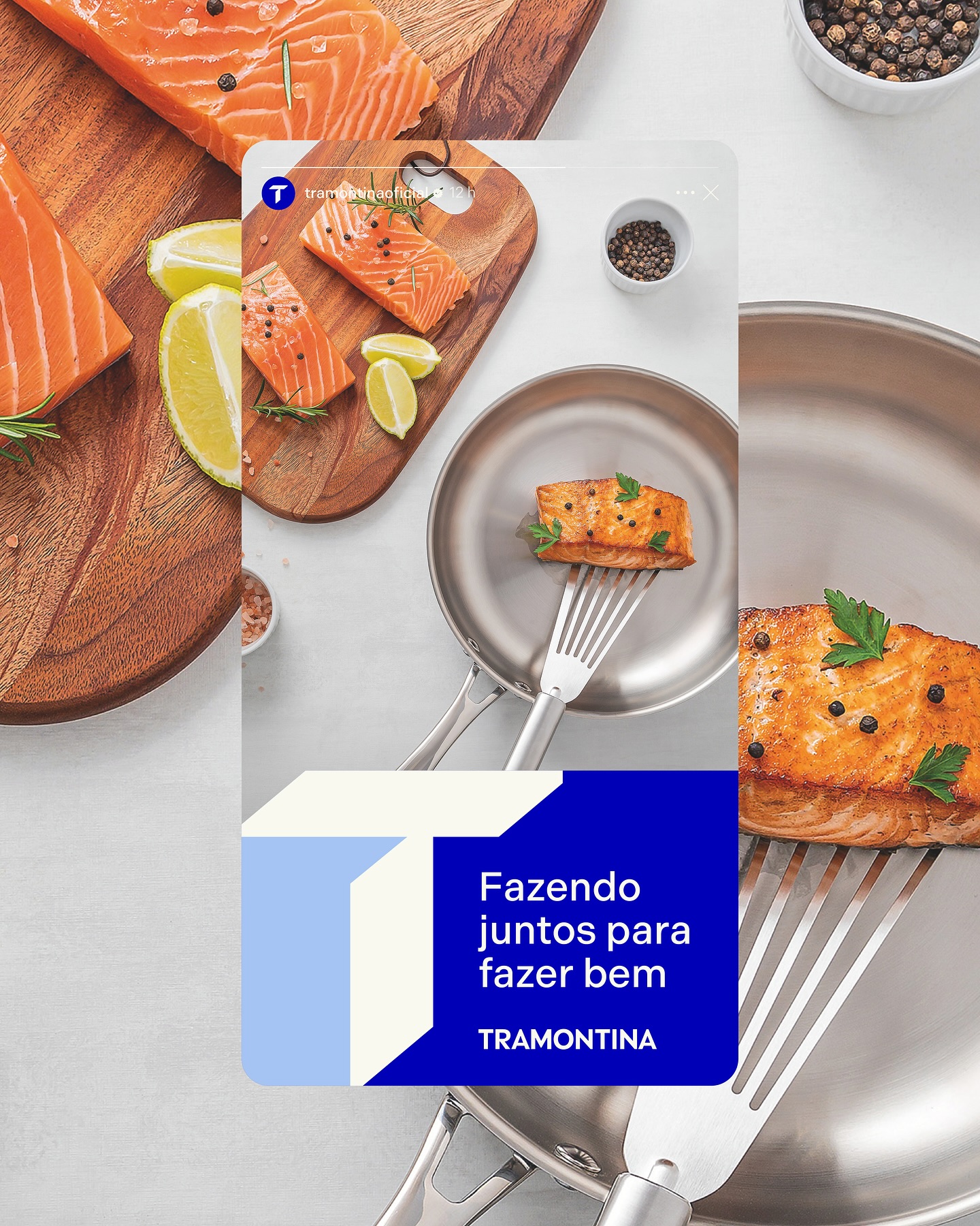
The project started with an in-depth review of Tramontina’s legacy, revisiting iconic elements such as the T symbol, the signature blue, and the subtle refinements that have shaped its identity over the past century. The redesign focused on refining and modernizing the identity system while preserving its recognizability. The logotype was adjusted for greater clarity and strength, the signature blue was updated to a warmer and more vibrant tone, and the logo was released from its previous container to increase versatility across applications. A custom monogram was also developed to expand the brand’s presence across new touchpoints. The new T symbol was constructed from the intersection of two steel plates, referencing Tramontina’s core material and the durability of its products, while sculpted chamfers, precise angles, and reflective surfaces added a sense of strength and emotional connection. Finally, the proportions, curves, and spacing between the symbol and wordmark were carefully balanced to ensure seamless application across utensils, packaging, storefronts, and digital platforms.
Design Director: Cris Inoue; Design Team: Lucas Rodrigues, Gabriel Catte, Tauana Fernandes, Bianca Victorino, Erick Fugii, Luca Bacchiocchi; Logotype: Leopoldo Leal; 3D and Motion: Clint
Pharus Bright Design, 2025